
WEAVE
Context:
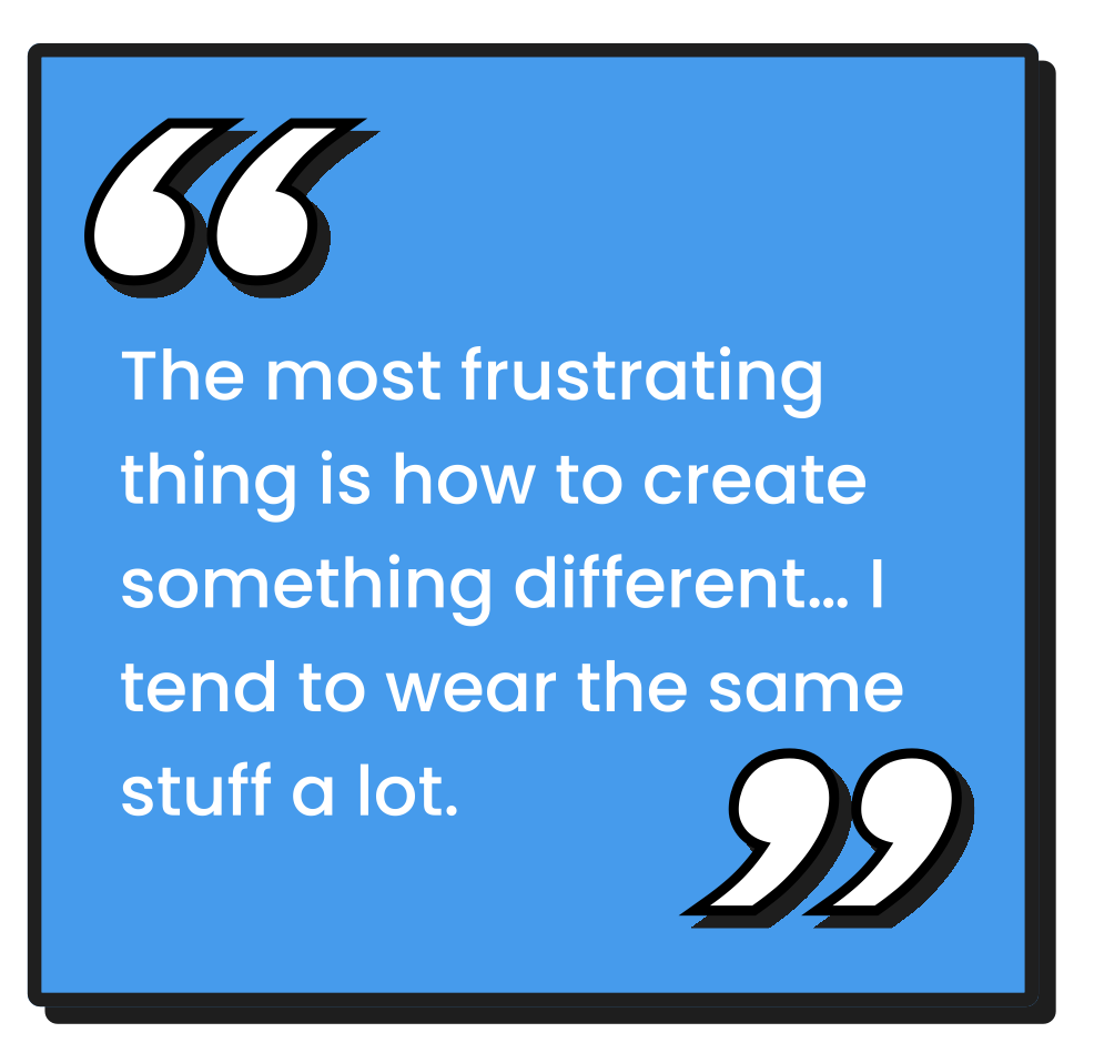
People often default to the same outfits because planning takes time and their wardrobe feels overwhelming to navigate. For this project, I set out to understand how users make daily outfit decisions and how a digital tool could simplify that process. My goal was to design an experience that reduces decision fatigue, increases wardrobe visibility, and supports more intentional styling.
Process:
I conducted user interviews to understand how people choose outfits, what frustrates them, and where decision fatigue emerges. I synthesized the insights through an affinity diagram to uncover patterns in behavior and pain points, then developed a primary persona to guide design decisions. Using MoSCoW prioritization, I identified the core features that would deliver the most value to users. From there, I designed and iterated on mid- and high-fidelity prototypes and built a cohesive design system to ensure visual consistency and accelerate further design work. Usability testing informed refinements to the final interactions and user flows.
Result:
The final prototype delivers a personalized outfit-planning experience where users can quickly build cohesive looks, understand their wardrobe habits, and explore smarter recommendations. The design system improved visual coherence across the product, and user insights directly informed feature prioritization. The outcome is a validated, user-centered concept that demonstrates how thoughtful UX can turn everyday dressing into a streamlined and expressive experience.
Tools:
Figma, FigJam
Skills:
UI/UX Design, User Research
Class:
UX Design
Problem & Context
Users lack visibility into their wardrobe
Leads to low outfit variety and unused items
Existing tools feel outdated or not intuitive
Opportunity for a clearer, modern closet experience
Research
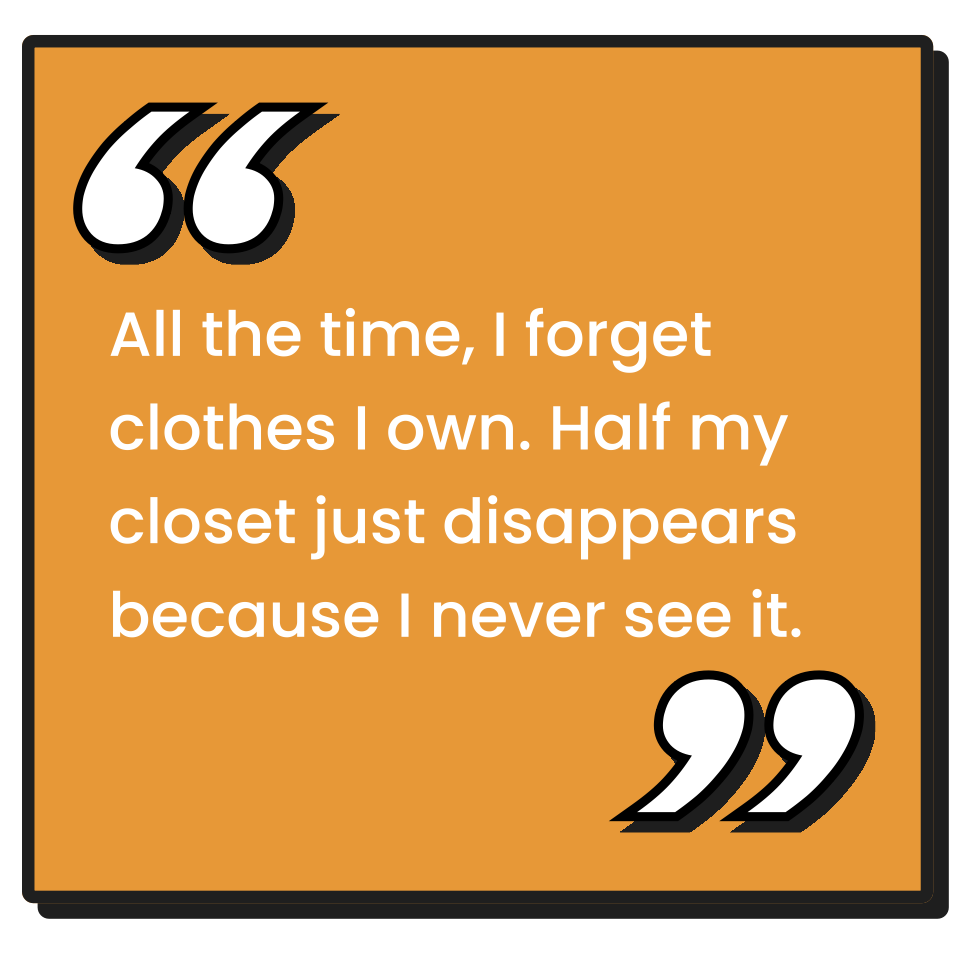
I conducted seven user interviews across a range of ages and genders to understand diverse wardrobe behaviors. Through these conversations, I explored users’ outfit habits, pain points, and expectations around daily dressing, which helped reveal where decision fatigue occurs and what users truly value. These insights shaped early design choices and highlighted opportunities to make the product intuitive and accessible for all users.

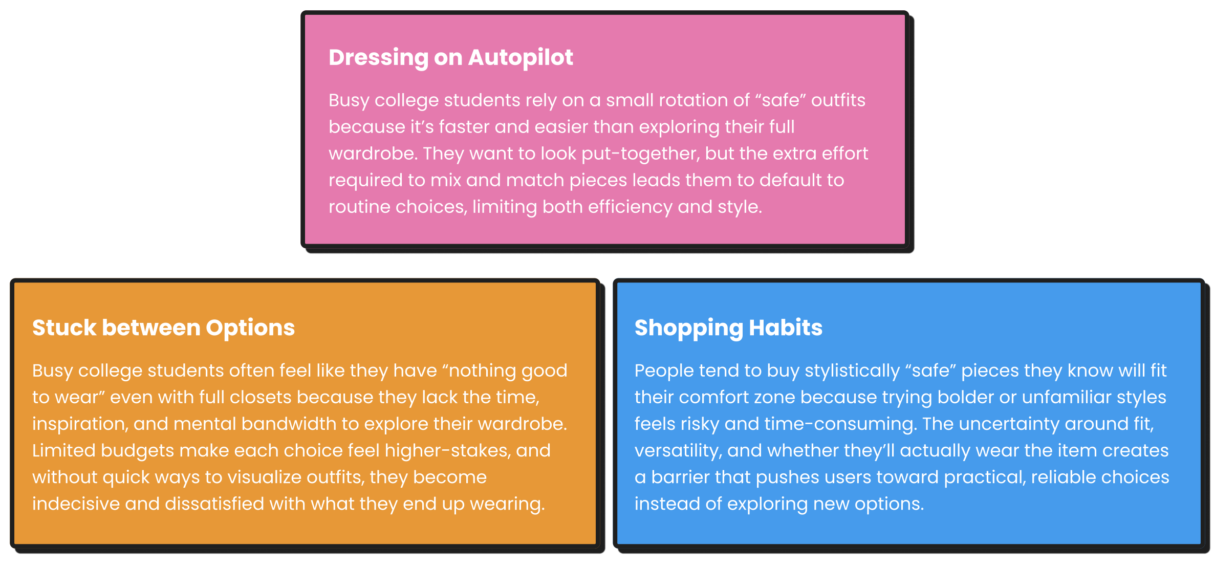
Affinity Diagram
I extracted key quotes and insights from all interviews, then grouped the findings into clear themes and pain points. This synthesis revealed meaningful patterns in user behavior and wardrobe challenges, helping shape the foundation of the design direction.

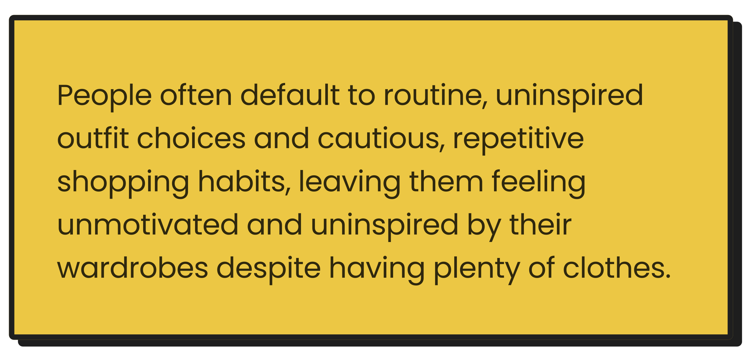
Key Insights
Problem Statement
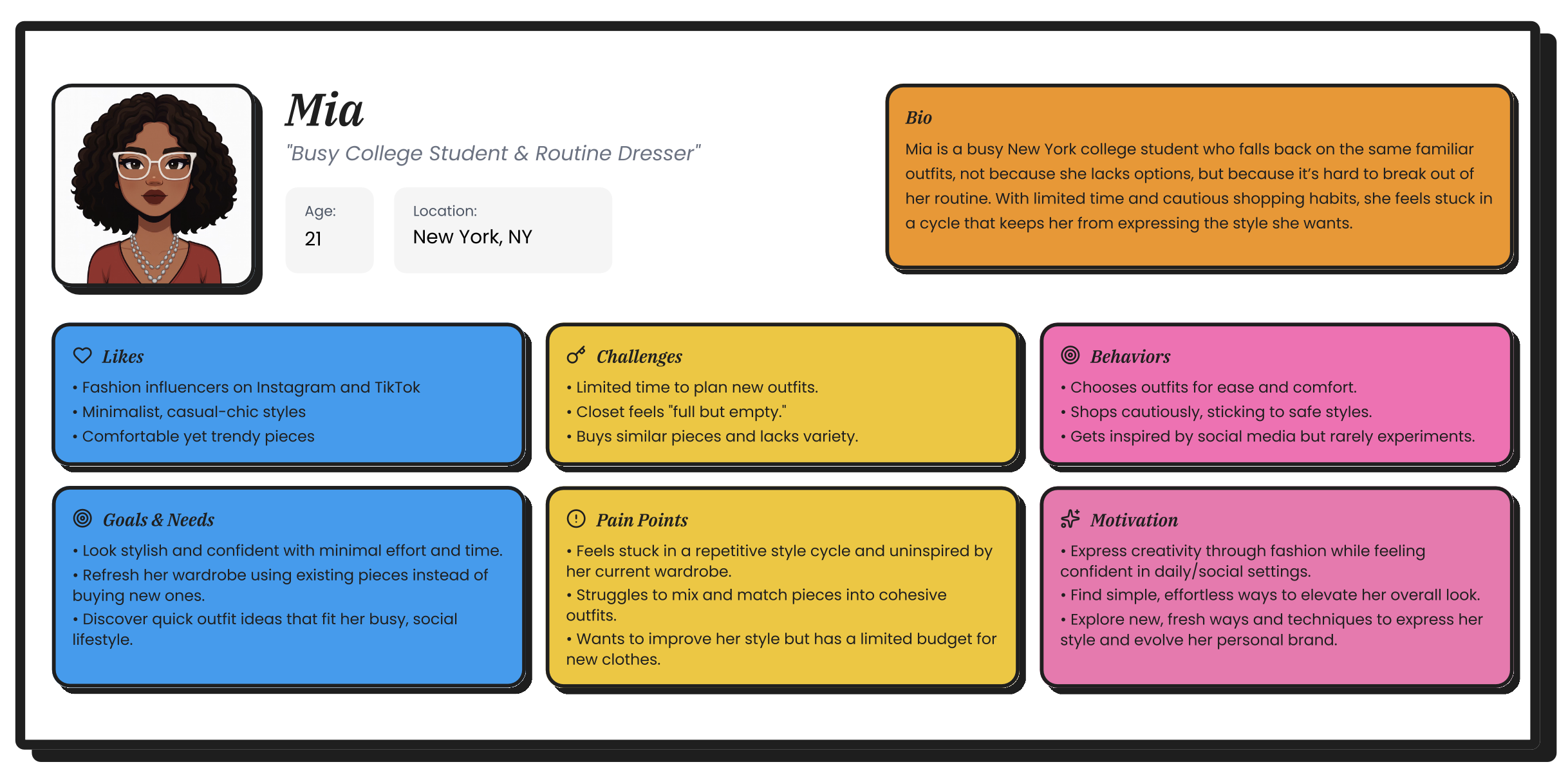
Persona
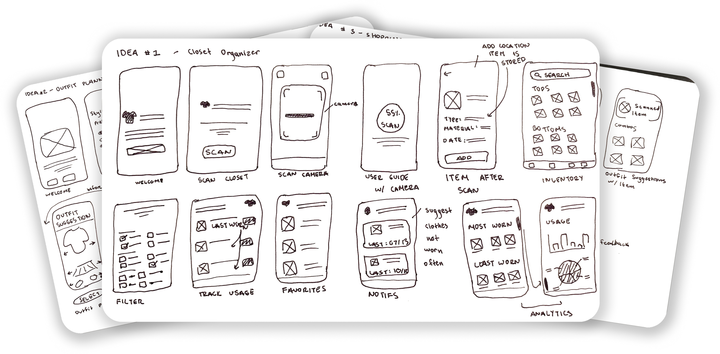
Napkin Sketches
I explored three directions: a closet organizer, an outfit planner, and a shopping helper. I compared them based on user needs and feasibility, ultimately selecting the concept and main features that best addressed visibility issues and outfit decision pain points.
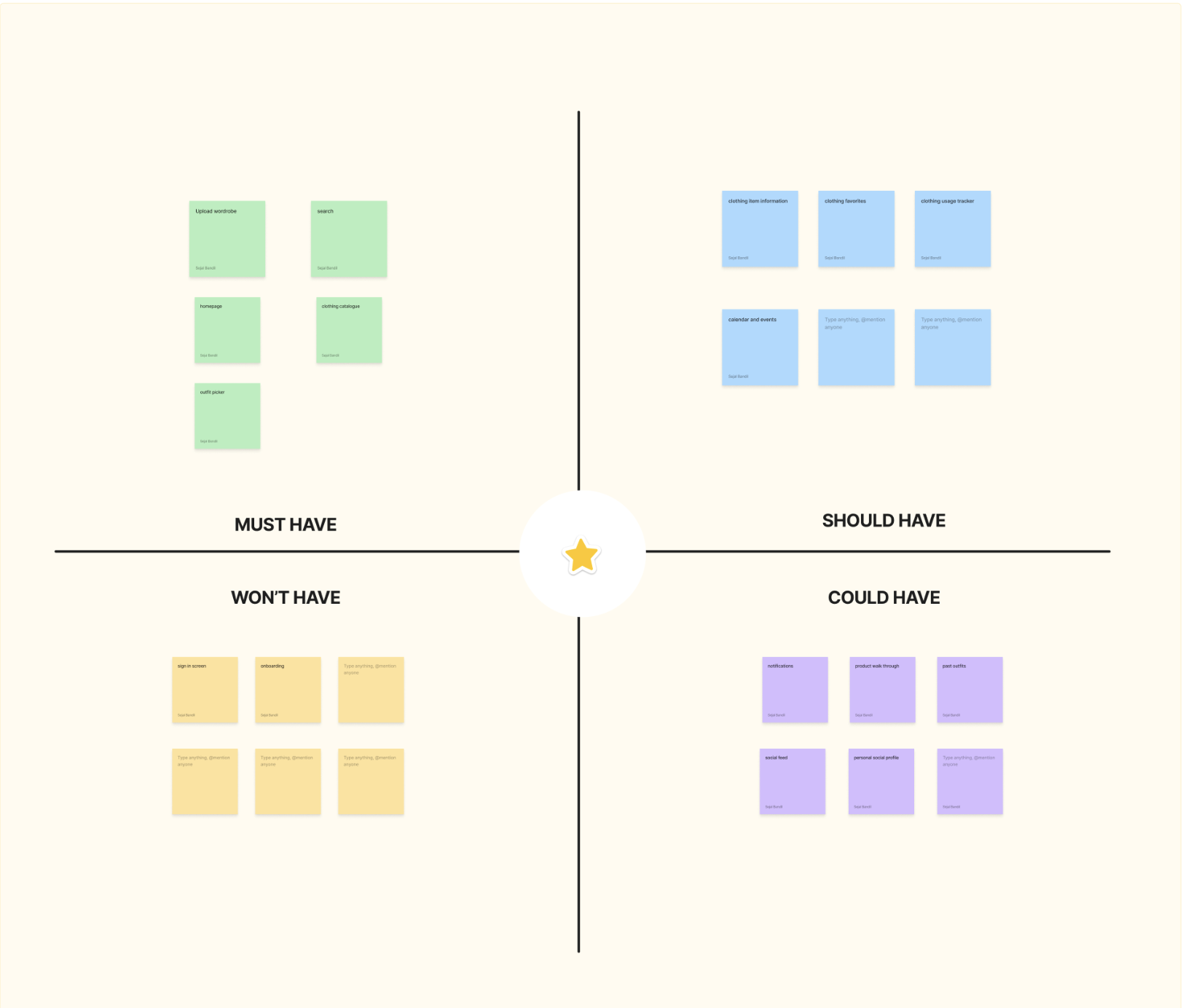
MoSCoW
I prioritized key features from early napkin sketches using the MoSCoW method, identifying the Must-Have features such as wardrobe upload, outfit builder, and closet catalog, and the Should-Have features including usage tracking, item details, and a calendar view to guide the first design iteration.
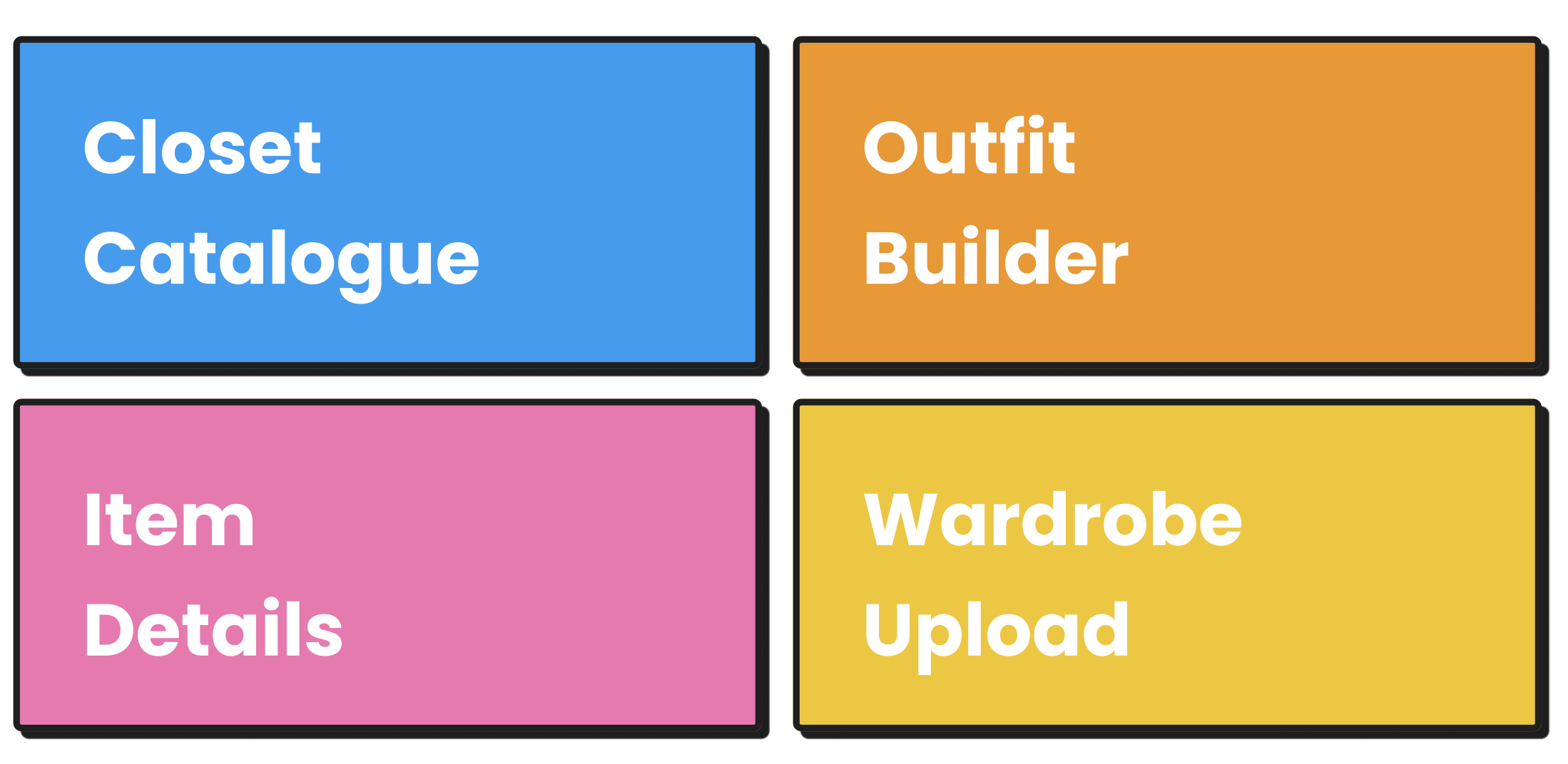
Key Features
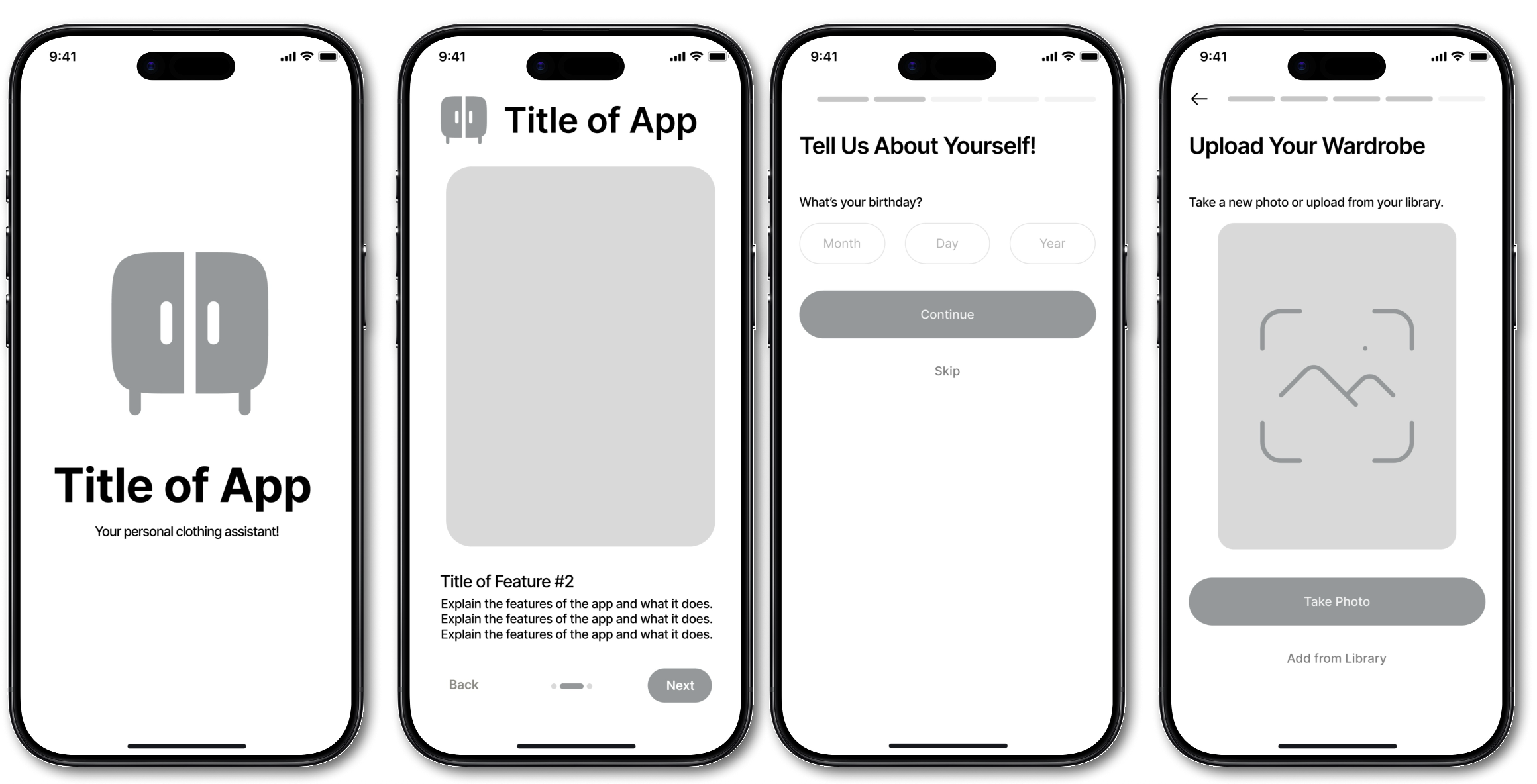
Mid-Fidelity
I translated prioritized features into mid fidelity wireframes to define core layouts, user flows, and interaction patterns without the distraction of visual styling. This stage focused on refining the information architecture, validating navigation clarity, and ensuring that key tasks such as uploading wardrobe items and building outfits felt intuitive. Through iterative feedback, I strengthened the structure and flow to create a solid foundation for high fidelity design.
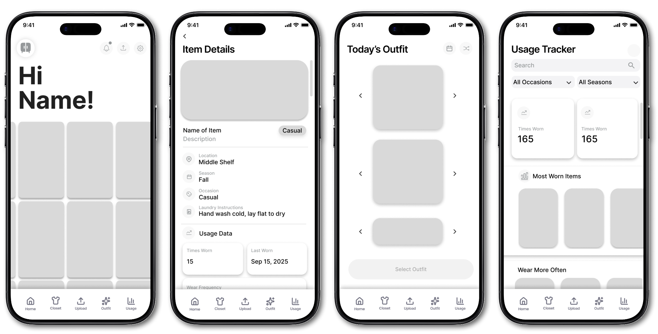
Old High-Fidelity
I created an initial high fidelity prototype to bring the core features to life with cohesive visual styling, iconography, and early brand direction. During critique sessions, I received feedback that the visual language felt too traditional for a fashion product, and that the interface could be more bold and playful to better reflect user expectations. This insight informed the next design iteration and guided the development of a more distinctive and fashion forward visual identity.
Branding and Design System
I developed a cohesive branding direction and design system to create a consistent and scalable visual foundation for the product. This included defining the color palette, typography, iconography, and UI components that shaped the tone and personality of the app. I focused on crafting a visual language that felt bold, colorful, and fashion forward, reflecting the energy and creativity users bring to outfit building. The design system streamlined the transition into high fidelity screens and enabled faster, more intentional iteration across the entire product experience.
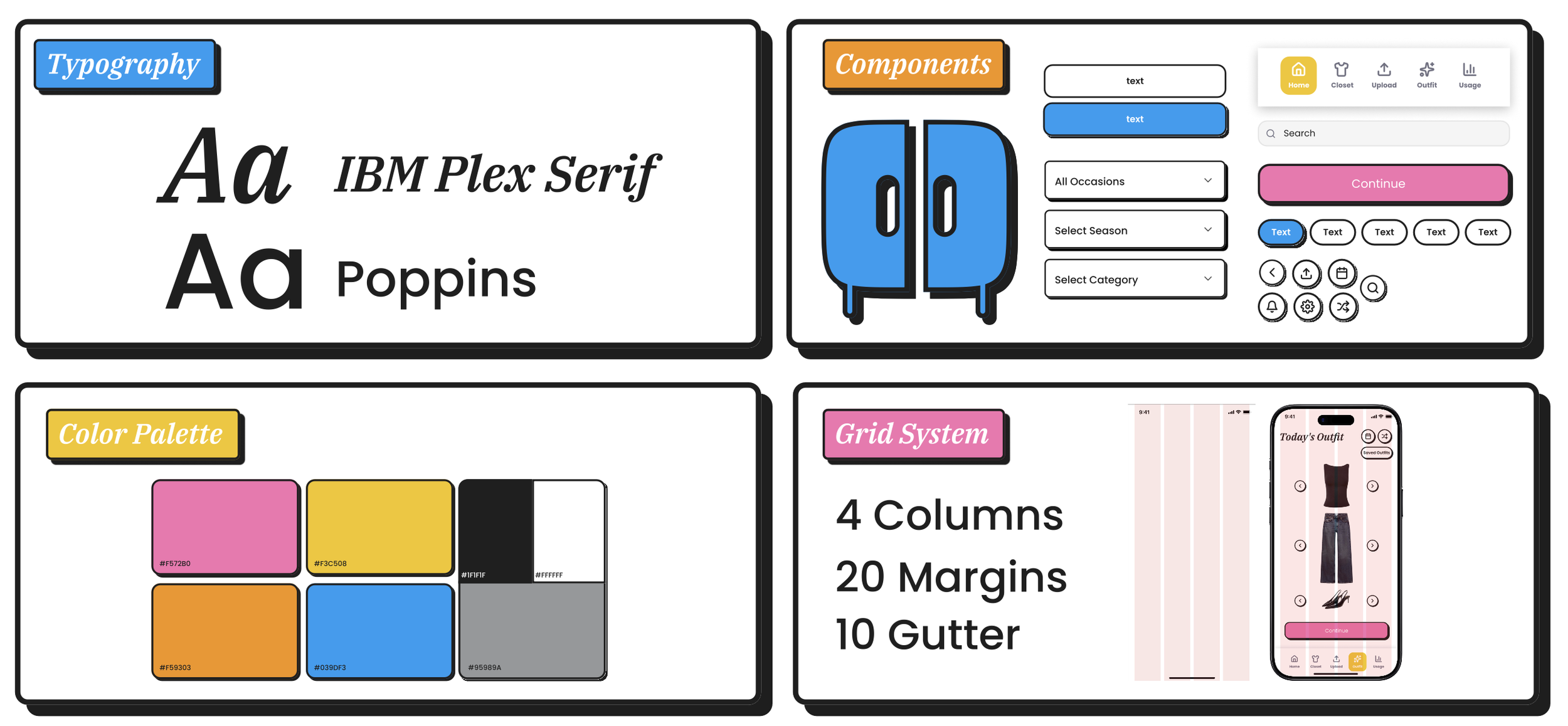
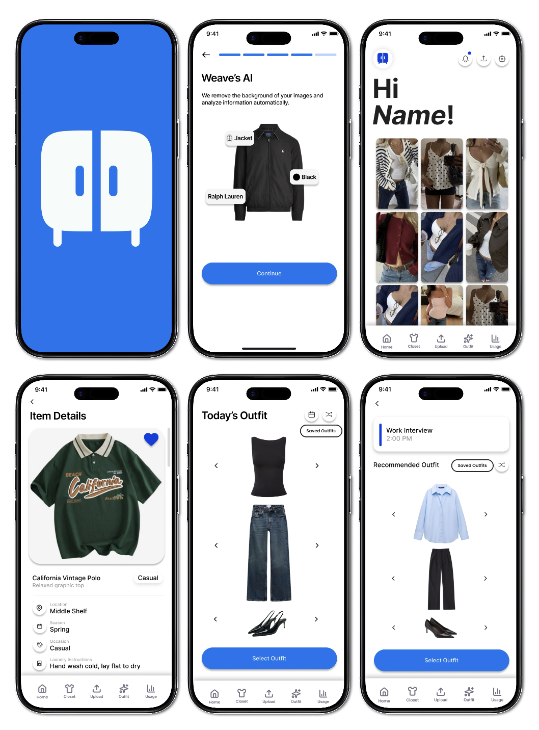
Final High-Fidelity Prototype
The final high fidelity prototype showcases a refined visual language, cohesive design system, and polished interactions across onboarding, wardrobe capture, and outfit building. It brings the bold and colorful, fashion forward aesthetic to life while ensuring the experience feels intuitive, consistent, and personalized to user needs. Click here to play the interactive prototype!
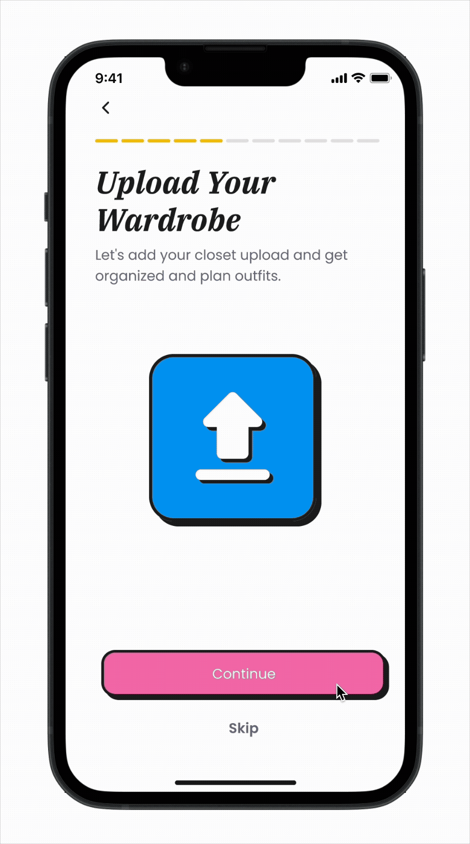
Onboarding
The onboarding flow captures users’ style, goals, and preferences to improve recommendation accuracy. Since many users have an unclear style identity, incorporating tags helps refine personalization and better align results with their taste. This approach meets a core user need for tailored outfit guidance rather than generic suggestions.
Upload Wardrobe
Users capture their clothes to build a digital closet, giving them visibility into items they often forget. Creating this digital inventory supports users who typically dress on autopilot by helping them see more of what they own. My research showed that users are willing to invest time in uploading items once if it delivers high future value, such as smarter recommendations and easier outfit planning.
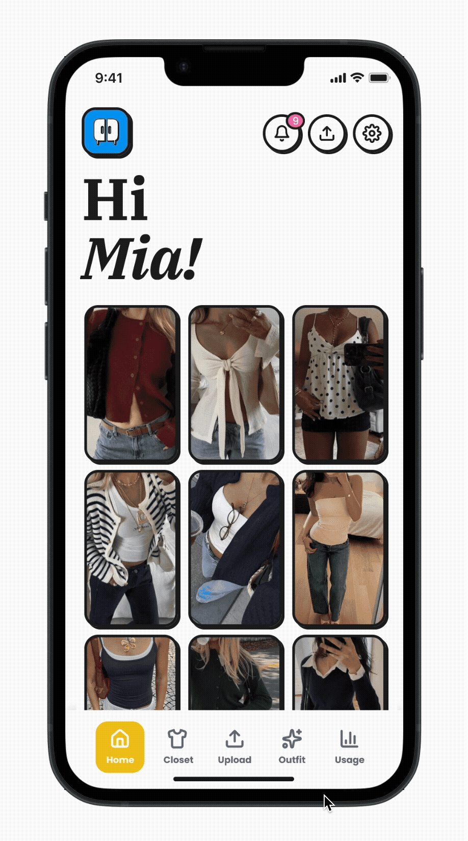
Digital Closet
Users often forget or lose track of items in their wardrobe, especially seasonal pieces, which results in only a small portion of their closet being worn regularly. Many also struggled to mix and match outfits, so displaying key details like season, occasion, and location helps them make quicker and more confident outfit decisions.
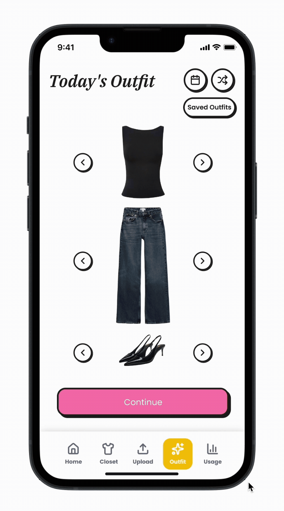
Outfit Builder
Users want help creating outfits rather than defaulting to the same familiar looks, and many rely on quick, convenience based choices when getting dressed. This feature enables fast item swapping and smart outfit builds that adapt to personal style, weather, and context, helping users make more intentional and expressive wardrobe decisions.
Calendar
Users frequently feel unsure about what is suitable to wear for different events and environments, and their choices often hinge on contextual factors like weather, plans, and activities. By linking events to context aware outfit suggestions, this feature helps users quickly identify options that match the occasion and supports smoother, more confident decision making.

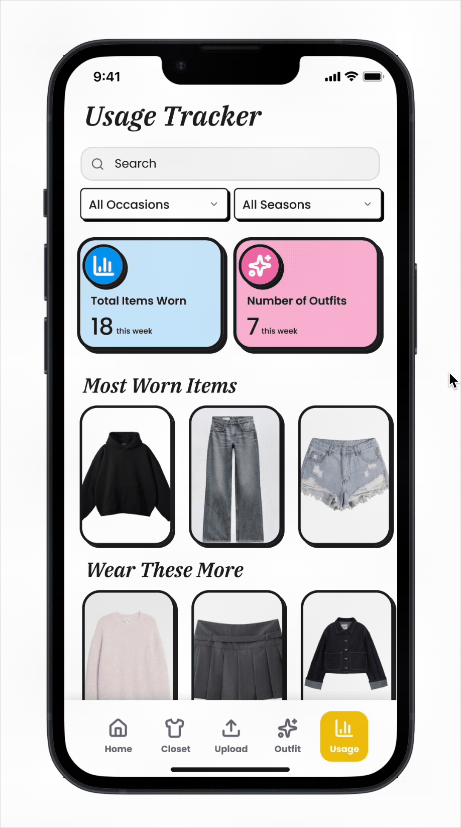
Usage Tracker
Users often forget what they own and end up wearing a small rotation of default pieces. Many expressed a desire for greater visibility into their wardrobe habits so they can avoid neglecting items they actually like. This feature provides clear stats and highlights most worn and underused pieces, helping users make more intentional outfit choices and get more value from their wardrobe.
Additional Projects
In addition to the final project for my UX Design class, I worked on two other impactful projects:
Headspace Onboarding Redesign: Focused on enhancing first-time user engagement by redesigning the onboarding flow to make it more personalized, intuitive, and motivating.
AI Challenge: Collaborated on a project using Figma to design and prototype a mobile app aimed at improving civic engagement in NYC, leveraging AI to connect citizens with local government initiatives.